A real-time dashboard for exploring vector memory — interactive knowledge graphs, collection analytics, semantic search, and maintenance controls built with FastAPI, HTMX, and D3.js.
A vector memory system with 7 collections and thousands of entries is opaque by default. You can store memories and recall them, but you can't answer basic questions: What does the system actually remember? How are memories connected? Which collections are growing? Which entries are stale? Is deduplication working?
Without visualization, memory becomes a black box — you trust it's working until it isn't, and you don't know why. The dashboard makes the invisible visible.
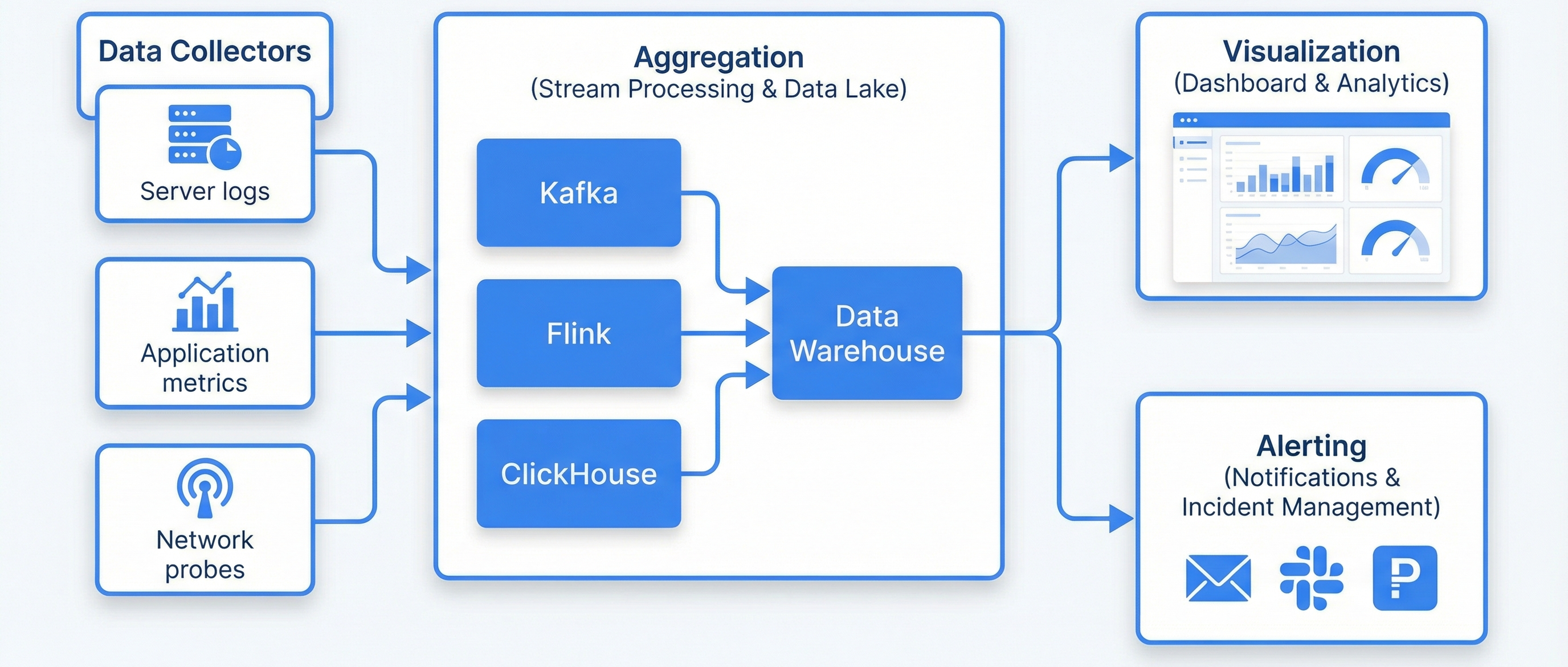
The dashboard is a lightweight web application that queries Qdrant directly and renders results using server-side HTMX with D3.js and Chart.js for visualization:
Browser ←→ FastAPI (Python)
              ├── HTMX partials (dynamic page updates)
              ├── D3.js (knowledge graph rendering)
              ├── Chart.js (analytics charts)
              └── Qdrant API (vector queries)
                   └── 7 collections (claude_memories, short_term, working, learnings, procedures, trajectories, episodes)
The stack deliberately avoids heavy JavaScript frameworks. HTMX provides dynamic updates with server-rendered HTML fragments. D3.js handles the knowledge graph. Chart.js handles analytics. No build step, no node_modules, no bundler.
Collection stats at a glance: total memories, storage size per collection, last backup timestamp, system health indicators. The landing view when you open the dashboard.
Interactive D3.js force-directed graph. Nodes represent memories, edges represent semantic links (cosine similarity above threshold). Color-coded by collection. Click any node to inspect its content, metadata, and connections.
Table view of each collection with search, sort by similarity/date/type, and filter by tags. View full memory content, metadata, timestamps, and access history. Bulk operations for tagging and deletion.
Chart.js dashboards: growth over time (line chart), type distribution (donut chart), access frequency heatmap, dedup effectiveness metrics, collection size comparison (bar chart).
Search across all 7 collections simultaneously. Enter a query, see results ranked by similarity score with source collection and metadata. Useful for finding duplicate or related memories.
Trigger manual maintenance: organize (dedup + prune), forget (targeted deletion), snapshot (backup). View n8n workflow execution status. Monitor Qdrant and Ollama health.
| Endpoint | Method | Purpose |
|---|---|---|
| /api/collections | GET | List all collections with entry counts and sizes |
| /api/collection/{name} | GET | Browse entries with pagination, sort, filter |
| /api/search | GET | Semantic search across collections with similarity threshold |
| /api/graph | GET | Knowledge graph data — nodes and edges for D3.js |
| /api/analytics | GET | Aggregated metrics for Chart.js dashboards |
| /api/organize | POST | Trigger dedup + prune maintenance cycle |
| /api/health | GET | System health: Qdrant, Ollama, n8n status |
The D3.js force-directed graph visualizes memory relationships:
Build a memory visualization dashboard with these components:

1. FASTAPI BACKEND:
   - Endpoints: /api/collections, /api/collection/{name}, /api/search,
     /api/graph, /api/analytics, /api/organize, /api/health
   - Direct Qdrant integration via qdrant-client Python library
   - HTMX template rendering with Jinja2
   - CORS and authentication middleware

2. KNOWLEDGE GRAPH (D3.js):
   - Force-directed graph with memory nodes and similarity edges
   - Nodes sized by access frequency, colored by collection
   - Edge threshold: cosine similarity > 0.7
   - Click to inspect, drag to rearrange, scroll to zoom
   - Collection toggle filters and similarity threshold slider

3. ANALYTICS (Chart.js):
   - Collection growth over time (line chart)
   - Memory type distribution (donut chart)
   - Access frequency heatmap
   - Dedup effectiveness metrics
   - Collection size comparison (bar chart)

4. COLLECTION BROWSER:
   - Paginated table with search, sort, filter
   - Full memory detail view with metadata and tags
   - Bulk operations (tag, delete)

5. OPERATIONS PANEL:
   - Trigger organize (dedup + prune) manually
   - Trigger forget (targeted deletion)
   - Trigger snapshot (backup)
   - View n8n workflow status
   - System health indicators

6. DARK THEME:
   - Background: #0a0a0a, accent: #60a5fa
   - Cards with subtle borders and hover effects
   - Responsive layout (desktop + tablet)

7. DOCKER:
   - Dockerfile with Python 3.11, uvicorn
   - Health check endpoint
   - Environment variables for Qdrant URL and API key

Create the complete application with FastAPI routes, Jinja2 templates, static assets (D3.js, Chart.js), and Dockerfile.Server-rendered HTML fragments instead of a SPA. No build step, no node_modules, no bundler, no hydration complexity. The dashboard is a visualization tool, not an application — HTMX provides all the interactivity needed.
D3.js is the most flexible graph visualization library. It handles force-directed layouts, zoom/pan, click events, and custom rendering. The trade-off (more code than a graph library like vis.js) is worth it for full control over the visualization.
The dashboard queries Qdrant directly via its REST API rather than going through the MCP server. This avoids coupling the dashboard to Claude Code's session model and allows independent operation.
Async support, automatic OpenAPI docs, Pydantic validation, and modern Python features. FastAPI is the natural choice for a Python API service in 2026.
The dashboard is the primary visual interface into the Qdrant vector store. It reads all 7 collections, renders their contents, and provides maintenance controls.
Audit events from the governance framework could feed into dashboard analytics — visualizing policy decisions, denials, and trust evaluations over time.
Context health metrics could display alongside memory health — providing a unified view of both persistent (vector) and ephemeral (context window) memory states.
The operations panel connects to n8n to display maintenance workflow status and trigger manual runs for organize, prune, and backup operations.